Walk to the center of the Arcade.
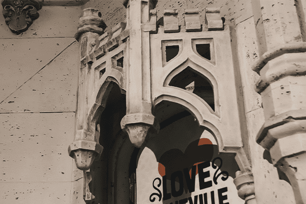
Notice the Gothic canopies surrounding the small windows to the left and right of the elevator bank. The castle-like canopy, with its battlement evolved from a Norman fortification to a short-lived style employed by Henry VIII. You will find the winged grotesque on the corners of the elevator supports. The Atlantic Terra Cotta Company’s versatility is demonstrated by this figure, shaped within its base rather than attached to it.
The popularity of terra cotta firewalls and decoration in the United States came with the invention of structural steel and skyscrapers. Architects such as Parker submitted drawings to the terra cotta company, which then made molds that accounted for shrinkage. The demon is a superior example, as it also features the Gothic mode of asymmetry. Set at a distance, it is tamed by the building’s essential symmetry. Note the slight differences in expression.

Look around the corner to find the figure with flowing hair.
She couldn’t be more Roman. Either it’s a Medusa head, used above doorways to ward off evil or a sun deity. It’s hard to tell because Renaissance decoration, from which the Arcade’s style is derived, had already begun to greatly separate designs from their original meanings.


Elevator lobbies were often the object of rich decoration in early skyscrapers.
They represented the junction of the buildings’ two dimensions: horizontal and vertical. Height became associated with status. The original plan of the Arcade included a tower, rising from the center. The imagery in this area is of special importance, and it is unusual. The entablature of the doorways, found on both sides, is complemented by a kind of picture frame around a basket handle arch.
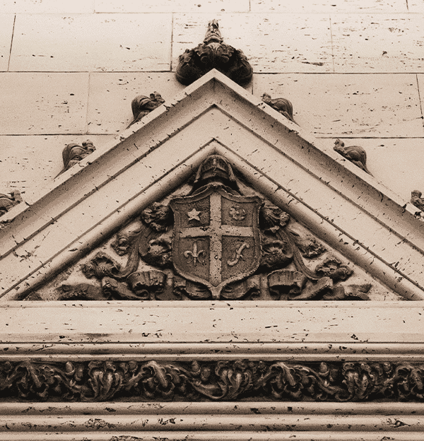
It’s clear that Parker had a design scheme in mind — an English Palladian style with Italian Renaissance roots. Pediments topped by three finials and decorated with shields had been noteworthy in 17th century British guild halls and theatres. Following the evolution of ornament, Parker stylized and combined motifs freely. Look at the shield — it contains a French Fleur de Lis.

The heads by the doorway’s ornamental frame are the most dominant figures in the Arcade.
The heads announce the building’s spirit – a spirit associated with Michelangelo, who liked gargoyles, free flowing tracery, travertine and creamy-white buildings.
Stylized plants decorate the Grove Arcade’s interior halls and columns.
Many of these plants are not symmetrical, revealing a baroque tendency toward free form and flourishes. The Baroque ceiling terra cotta decoration, which adorns the Arcade, represented the fourth largest budget item after concrete, plain plaster, and plumbing and heating.
Spandrel is the area between the top of a column and the apex of the arch springing from it. The spandrel decoration, found in the East Arcade, borrows from English Gothic churches which used the motif of a ball-flower — three-petals forming a globe — often without its leaves, as a repeating ornament along moldings
Notice the images of the acanthus plant — a perennial with blades that seem to emerge directly from the ground. It is one of the most pervasive symbols in architectural ornamentation. Discovered growing around a stone in a cemetery, it was incorporated by the builder of the Temple of Corinth into the capitals of pillars. It has come to represent classical antiquity and immortality, and later, a Christian symbol of the consciousness of pain and sin because of its thorns. The faces of the maiden and crone reinforce the symbolism.

Grove Arcade features a variety of store designs unlike the original arcades in Paris — with their galleries of identical stores.
The building also provided an opportunity for combining two or more spaces, as some current shops have done. Still, the emphasis is on marketing — rather than office, storage, delivery or specialized space — and thus walls are taken up with plate glass inside and out. Shoppers are presented not with a labyrinth to explore, but a catalog of selections along a single artery. This model facilitated window shopping.
Inside and out, the use of high-expense items such as marble and polished granite was considered a justified expense. It communicated high culture more than any image or statement. Money was saved on the travertine, the kind of marble that had been Michelangelo’s favorite. The Italian plasterers used a process they’d invented to simulate it by crumbling dried plaster into their wet mixture to create the bubbles and impurities that result from the natural process of limestone deposits in streams.
On the ceiling, the grapevine frieze, made of interlacing vines, illustrates the transition between classical pictorial imagery and Arabesque design, both seen in the Arcade. The grapevine, acanthus and other classical plants in the Arcade show that Grove and Parker were very familiar with the Italian Renaissance.


Decorative wrought iron work — such as that done for the staircase railings — is one of the crafts for which Parker hired skilled tradespeople.
Wrought iron was very popular in the Italian Renaissance and in the late 19th and early 20th century Arts & Crafts movement, the style of the Grove Park Inn. Grove brought on skilled Italian plasterers as well to work on the building.
