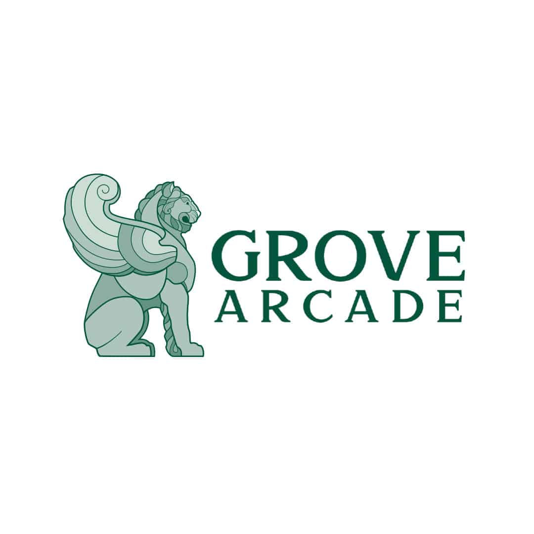
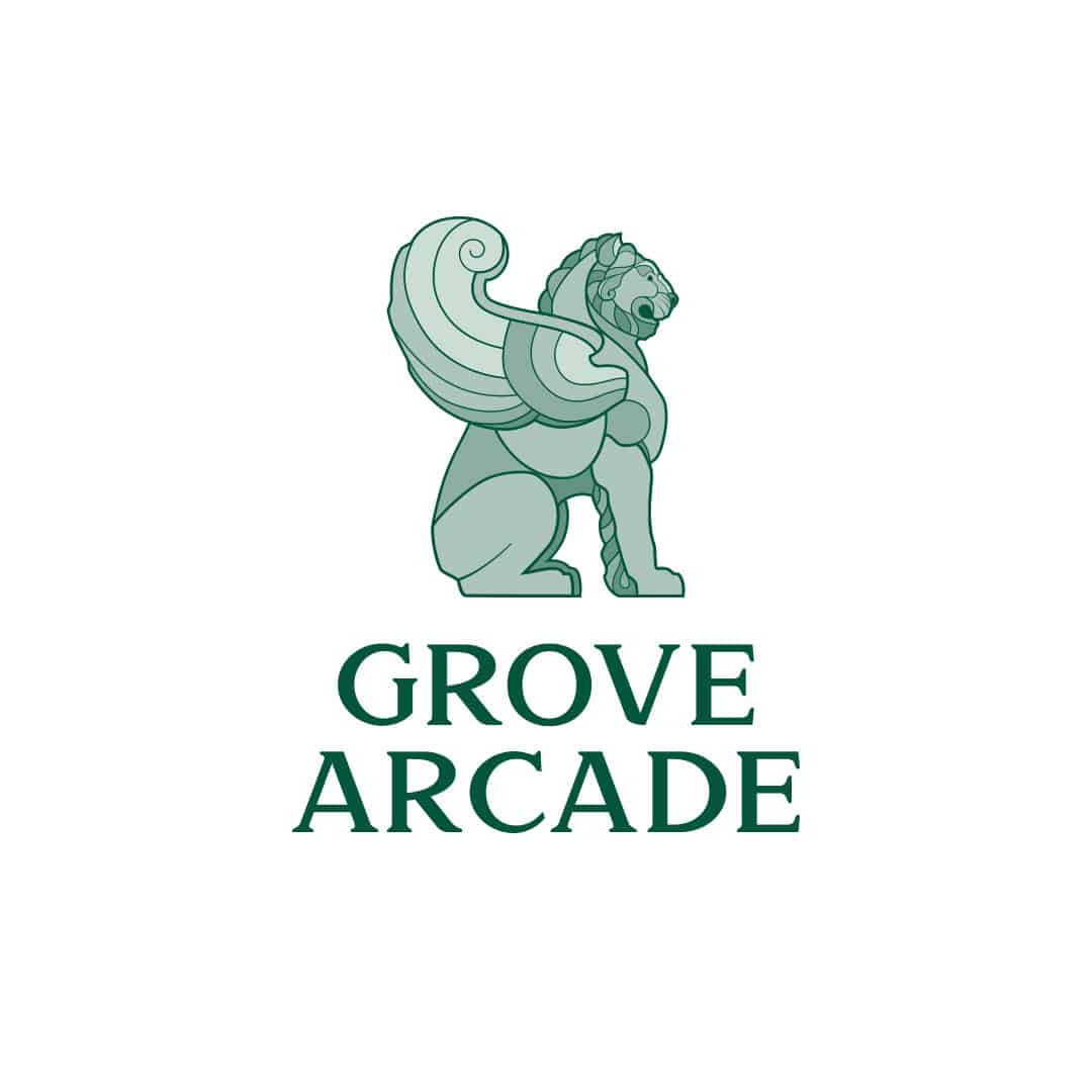
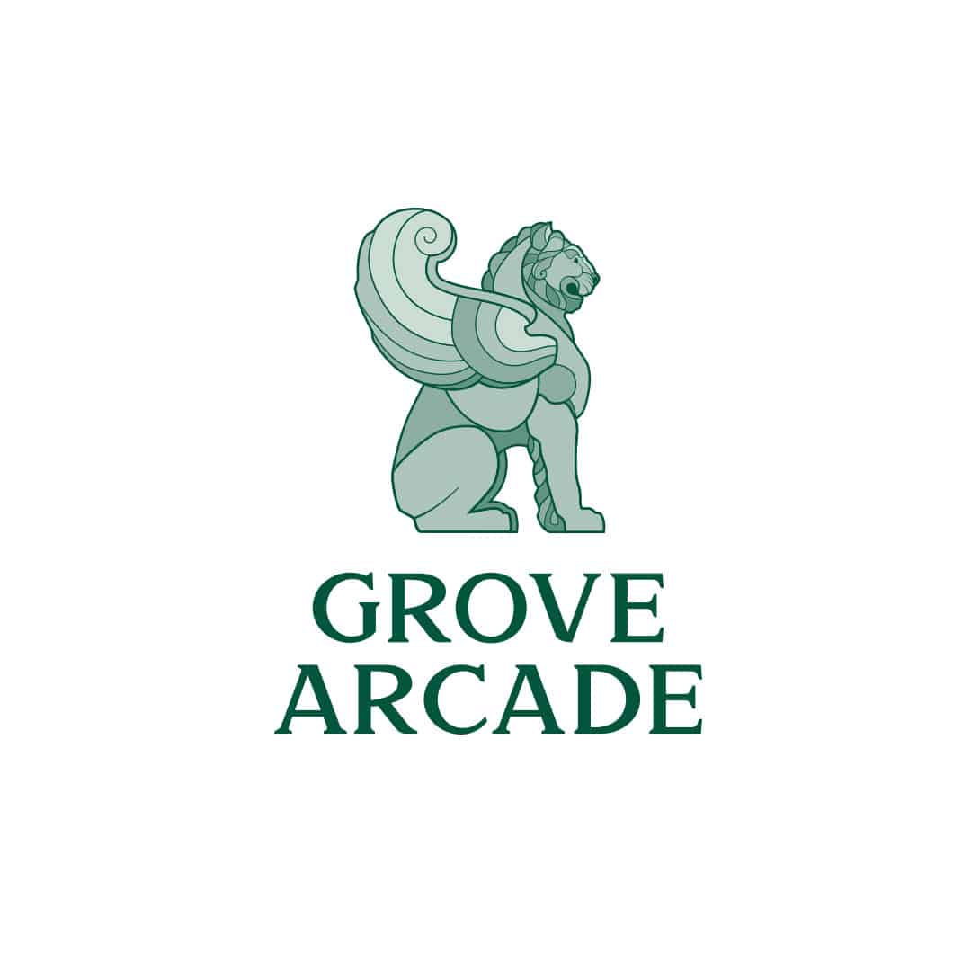
The Grove Arcade Logo is the key building block ofthe brand, the primary visual element that identifies Grove Arcade. The full-logo is a combination of the winged-lion symbol and wordmark – they have a fixed relationship that should never be changed in any way. Both identifiers, the winged-lion symbol and wordmark, can be used individually based upon use cases and special instances where one logo may make more sense with the application.
It is important to keep our logos clear of any other graphic elements. To regulate this, an exclusion zone has been established around the logo. This exclusion zone indicates the closest any other graphic element or message can be positioned in relation to the logo itself.
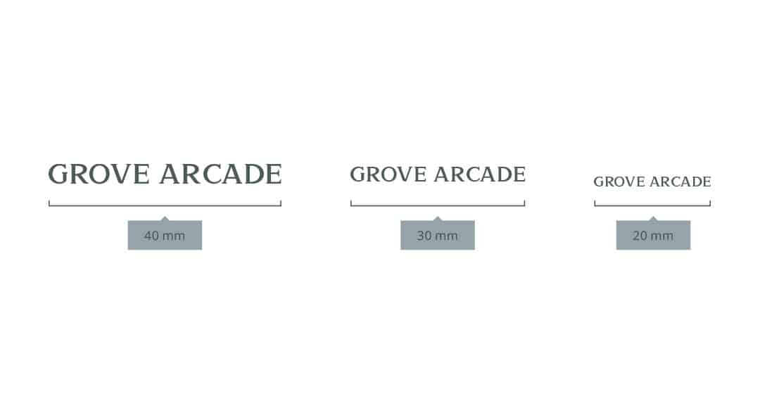
The Wordmark: Minimum Sizes
When using the Wordmark logo please adhere to the following guide for the minimum size of the logo.
20mm x 3.33mm 56px x 5px
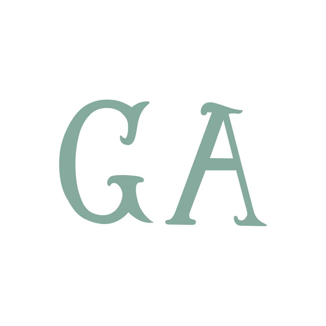
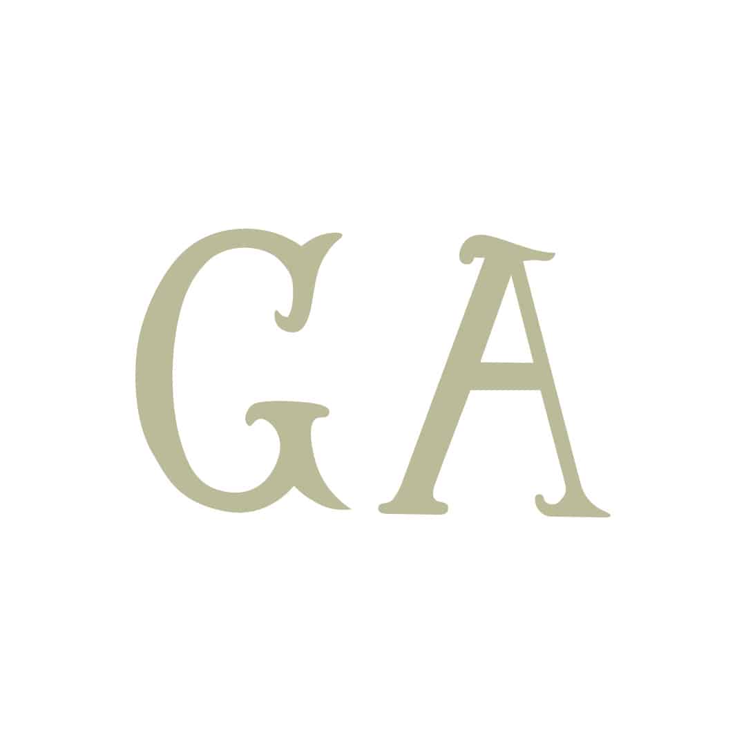
The Wordmark: Colors
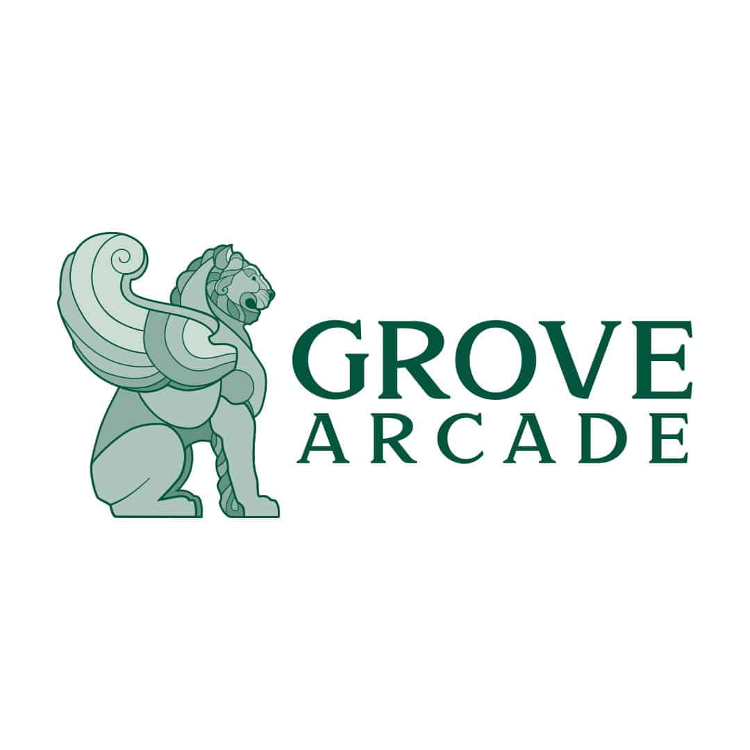
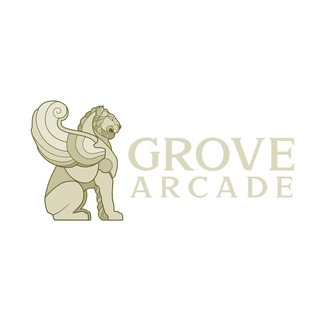
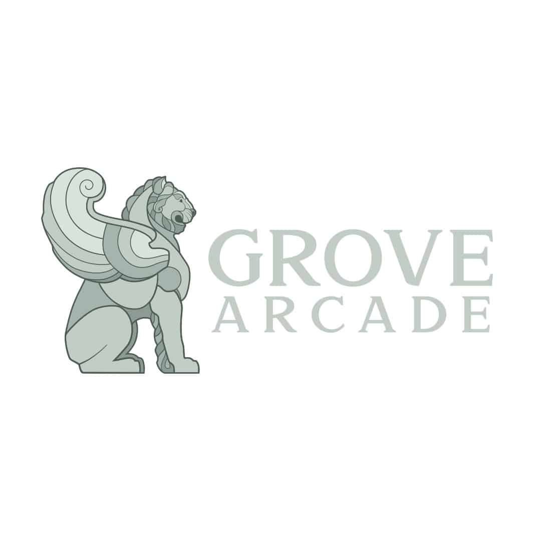
All of our logos maintain a consistent color scheme corresponding to the brand primary colors. The logos may be used in shades of the primary colors or in either black or white.
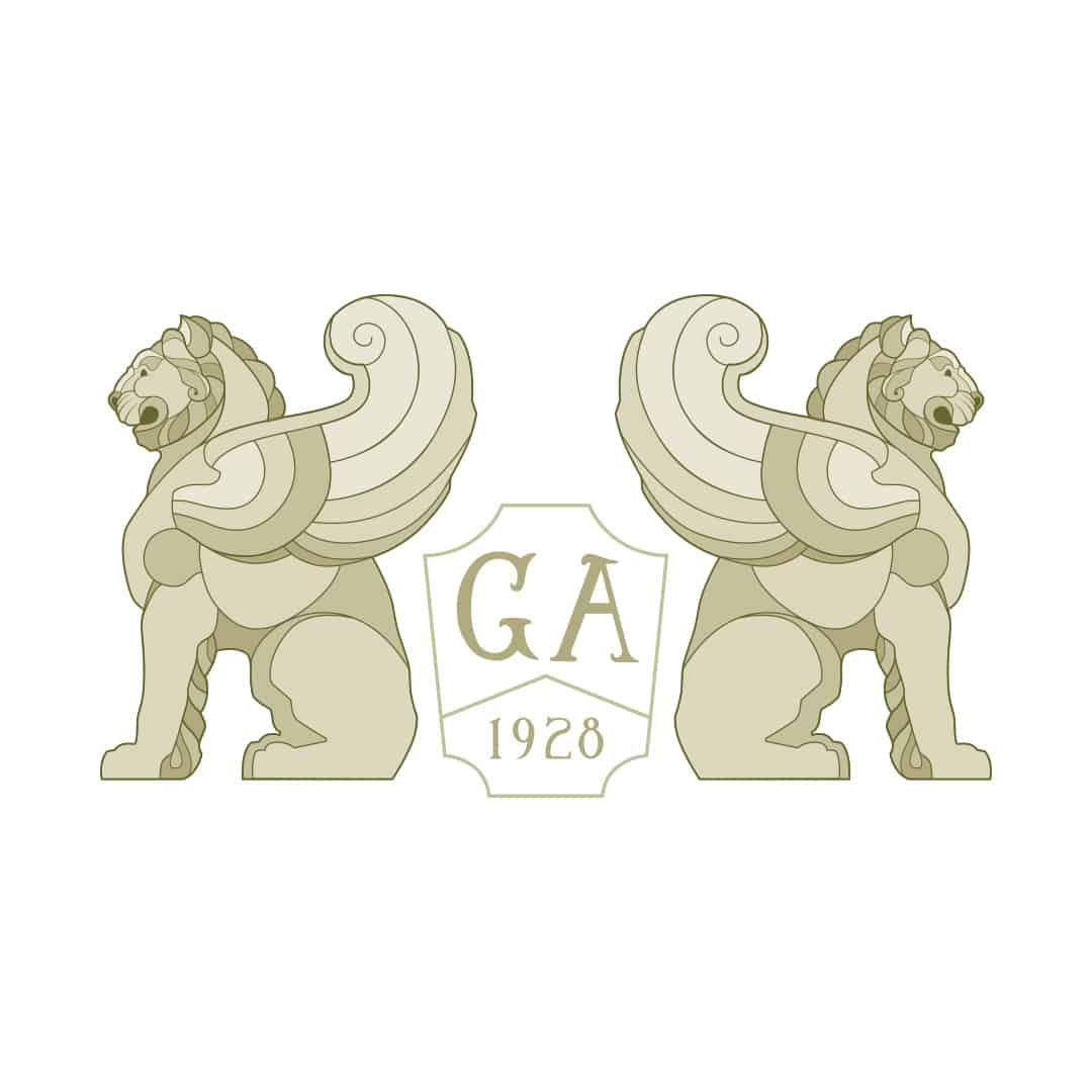
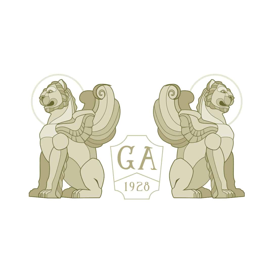
The Logo icon
The Icon: Clearspace
It is important to keep our logos clear of any other graphic elements. To regulate this, an exclusion zone has been established around the logo. This exclusion zone indicates the closest any other graphic element or message can be positioned in relation to the logo itself.
The Icon: Minimum Sizes
When using the Winged-Lion Icon Logo please adhere to the following guide for the minimum size of the logo. We have prepared a minimal-lined version of the icon to accommodate smaller sizes.
25mm | 71px 5mm | 14px
The Icon: Colors
All of our logos maintain a consistent color scheme corresponding to the brand primary colors. The logos may be used in shades of the primary colors or in either black or white.
The Full logo Inline
The Full Logo Inline: Clearspace
It is important to keep our logos clear of any other graphic elements. To regulate this, an exclusion zone has been established around the logo. This exclusion zone indicates the closest any other graphic element or message can be positioned in relation to the logo itself.
The Full Logo Inline: Minimum Sizes
When using the Full Logo Inline please adhere to the following guide for the minimum size of the logo.
20mm x 9mm 57px x 26px
The Full Logo Inline: Colors
All of our logos maintain a consistent color scheme corresponding to the brand primary colors. The logos may be used in shades of the primary colors or in either black or white.
The Full logo Stacked
The Full Logo Stacked: Clearspace
It is important to keep our logos clear of any other graphic elements. To regulate this, an exclusion zone has been established around the logo. This exclusion zone indicates the closest any other graphic element or message can be positioned in relation to the logo itself.
The Full Logo Stacked: Clearspace
When using the Full Logo Stacked please adhere to the following guide for the minimum size of the logo.
20mm x 3.33mm 57px x 10px
The Full Logo Stacked: Colors
All of our logos maintain a consistent color scheme corresponding to the brand primary colors. The logos may be used in shades of the primary colors or in either black or white.
Typography
Display & Title Typography Samford is a serif uppercase typeface with two main native weights, regular and bold; as well as, a custom made light and italic weight class. The Samford typeface was chosen for its unique use of serif caps, its thick line work, and its elegant style to embody the architectural nuances of Grove Arcade. The Samford typeface should only be used for the Grove Arcade logo and any H1 titles.
Heading Typography Brandon Grotesque is a sans-serif typeface designed by Hannes von Döhren of HVD Fonts. The typeface includes Thin, Light, Regular, Medium, Bold and Black weights. Italic versions are also made available for each weight. Brandon Grotesque was chosen to compliment the elegance established in the display typeface, while leveraging a more modern sans-serif typeface.
Paragraph Typography Open Sans is a humanist sans serif typeface designed by Steve Matteson, Type Director of Ascender Corp. Open Sans was designed with an upright stress, open forms and a neutral, yet friendly appearance. It was optimized for print, web, and mobile interfaces, and has excellent legibility characteristics in its letterforms making it an excelent selection for body and paragraph typeface.
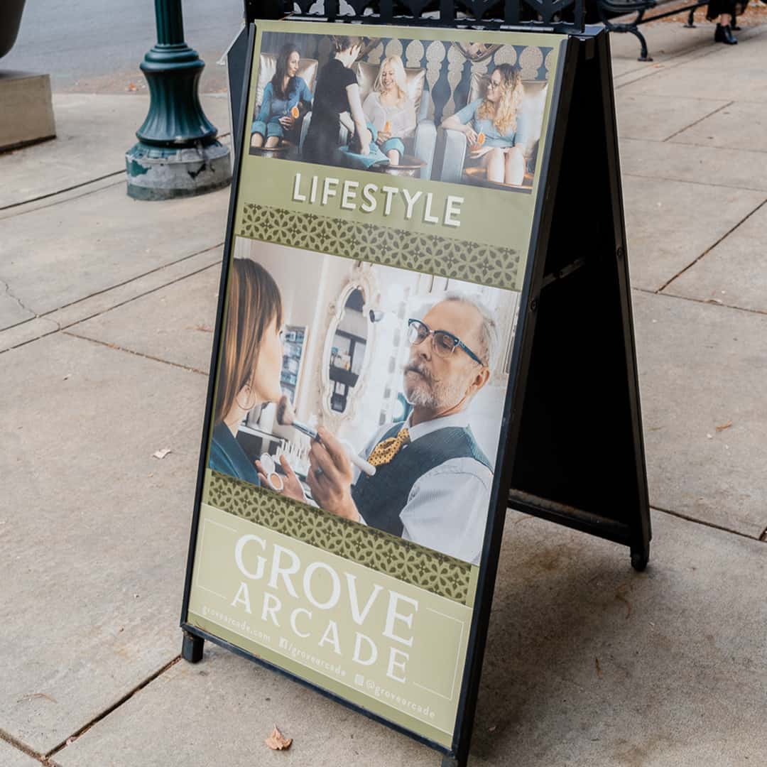
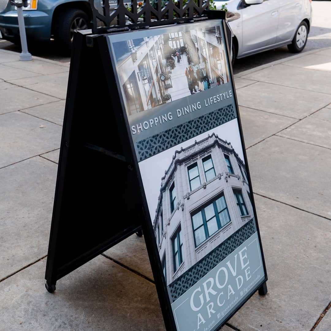
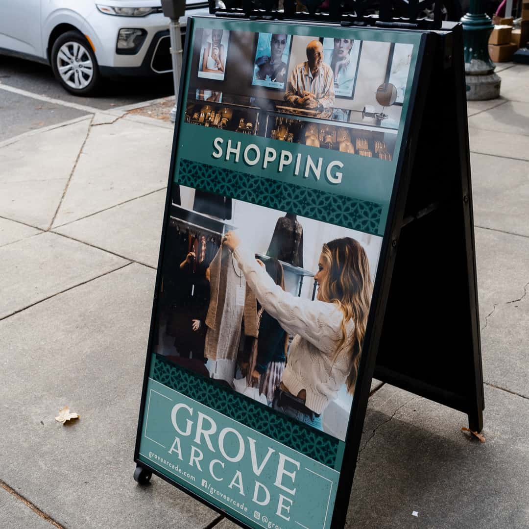
The Grove Arcade brand has four official colors: Grove Gold, Antique Blue, Grove Green, and Grove Red. These colors have become a recognizable identifier for the brand. Use them as the dominant color palette for all internal and external visual presentations of the company. Out of the 4 primary colors, 3 are used to represent the different services offered by Grove Arcade such as, shopping, dining, and lifestyle. Dining is represented by Grove Red, Shopping is represented by Antique Blue, and Lifestyle is represented by Grove Gold.
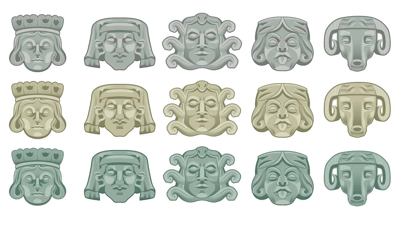
Faces Iconography Set Some of the most prolific faces found around Grove Arcade, this icon pack features the Prince from the blank wing, the mand in the headress from the center of the Arcade, the Medusa heads spread throughout the interior, the comedic Joker faces add some emotion to the otherwise stalwart expressions of the faces, and finally the Rams Head which is displayed on the main north and south entrances of the Grove Arcade.
Display & Title Typography Samford is a serif uppercase typeface with two main native weights, regular and bold; as well as, a custom made light and italic weight class. The Samford typeface was chosen for its unique use of serif caps, its thick line work, and its elegant style to embody the architectural nuances of Grove Arcade. The Samford typeface should only be used for the Grove Arcade logo and any H1 titles.
Alternative Winged-Lion Graphics Samford is a serif uppercase typeface with two main native weights, regular and bold; as well as, a custom made light and italic weight class. The Samford typeface was chosen for its unique use of serif caps, its thick line work, and its elegant style to embody the architectural nuances of Grove Arcade. The Samford typeface should only be used for the Grove Arcade logo and any H1 titles.
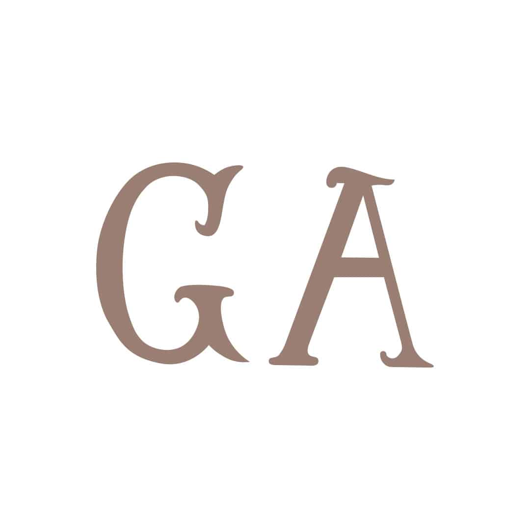
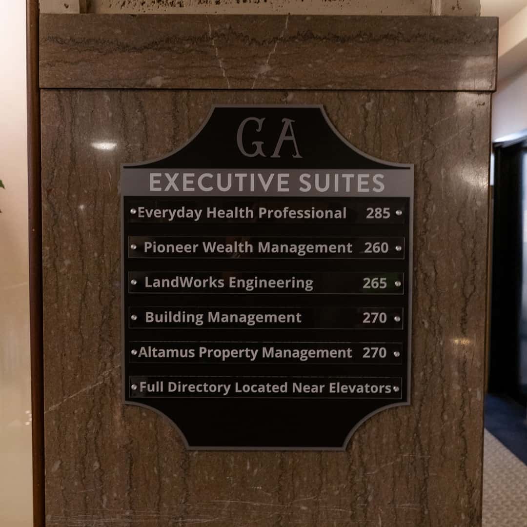
Grove Arcade Initial Graphics The letterforms that comprise the graphics were hand drawn from the ‘GA’ inscribed in the Grove Arcade Shield engraved in marble as you enter the North entrance. This graphic is used sparingly but is a integral part of both our brand identity and the Grove Arcade Shield graphic.
Grove Arcade Shield Graphic As mentioned above, the Grove Arcade Shield graphic is inspired by the metal shield engraved in the marble at the North entrance of Grove Arcade. It’s unique shape and the date of it’s first opening in 1928 appear alongside the Grove Arcade initials.
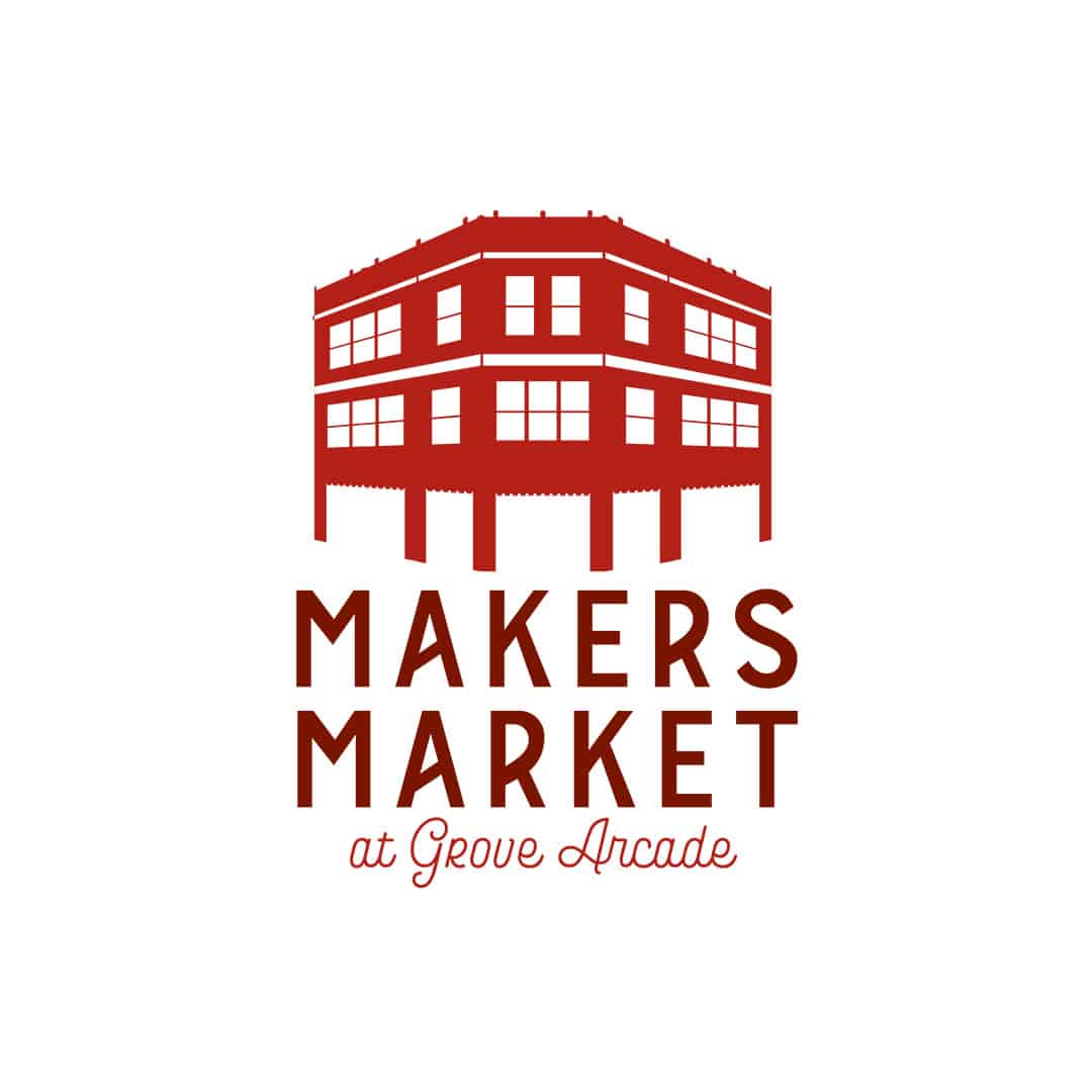
Brand Identity Guidelines Like The Residences, Makers Market is also a child brand of Grove Arcade. The Makers Market is an outdoor artist market that houses craftsman and artists alike. The Makers Market brand was designed and developed with inspiration from the various eclectic vendors that set up shop there. Through this inspiration, the brand boasts a more colorful brand palette and a vintage typeface scheme.
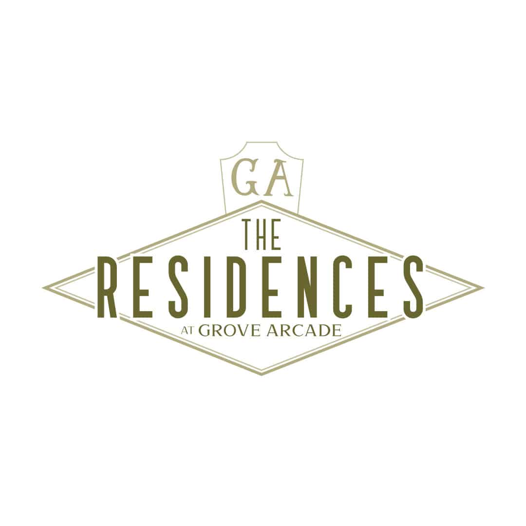
Brand Identity Guidelines A child brand of Grove Arcade, The Residences at Grove Arcade maintains its own brand identity to separate itself without straying away from core design and brand principles established by the parent brand.
Brand Identity Guidelines Like The Residences, Makers Market is also a child brand of Grove Arcade. The Makers Market is an outdoor artist market that houses craftsman and artists alike. The Makers Market brand was designed and developed with inspiration from the various eclectic vendors that set up shop there. Through this inspiration, the brand boasts a more colorful brand palette and a vintage typeface scheme.
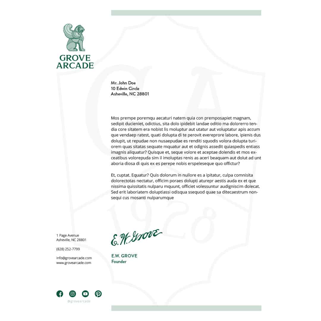
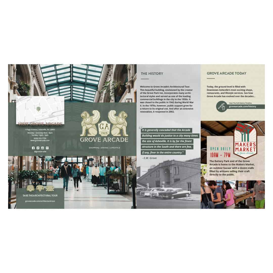
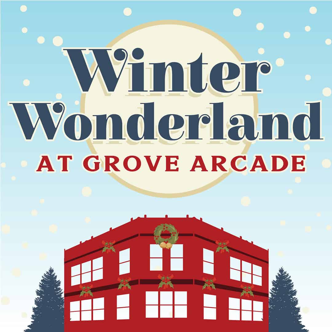
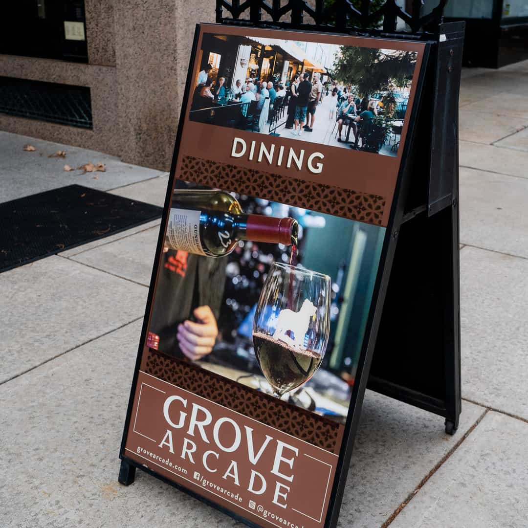
Collateral Bank Using the brand identity established we have created and continue to create collateral such as brochures, signage, logo variations, and more that expand the brand. If there are collateral pieces you are looking for that are missing please contact us.
Brand Identity Guidelines Like The Residences, Makers Market is also a child brand of Grove Arcade. The Makers Market is an outdoor artist market that houses craftsman and artists alike. The Makers Market brand was designed and developed with inspiration from the various eclectic vendors that set up shop there. Through this inspiration, the brand boasts a more colorful brand palette and a vintage typeface scheme.